Salesforce Philanthropy Cloud

Mobile App · B2B2C · Product Design · Design System

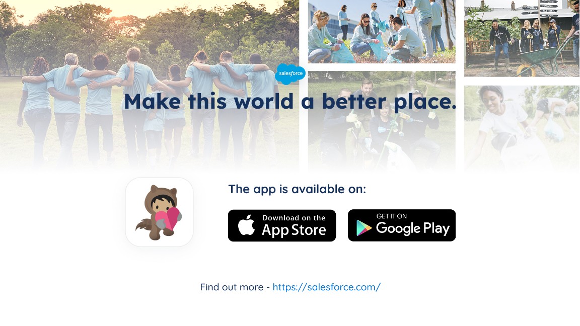
Salesforce Philanthropy Cloud provides a platform connecting employees, companies, and nonprofits to transform corporate social responsibility. As Lead Mobile App Designer, I led the design and delivery of the Android app from concept to release in under one year, alongside ongoing improvements for iOS, creating a seamless cross-platform experience for enterprise giving.

Client

Salesforce

Services

App Design (iOS & Android) UI & UX Design Design System Cross-platform Design User Research & Testing

Industries

Technology, SaaS, Corporate Social Responsibility

Date

July 2020 - June 2022

app screen

The ask

Delivering a native Android app from scratch while improving the existing iOS experience and ensuring cross-platform design consistency.

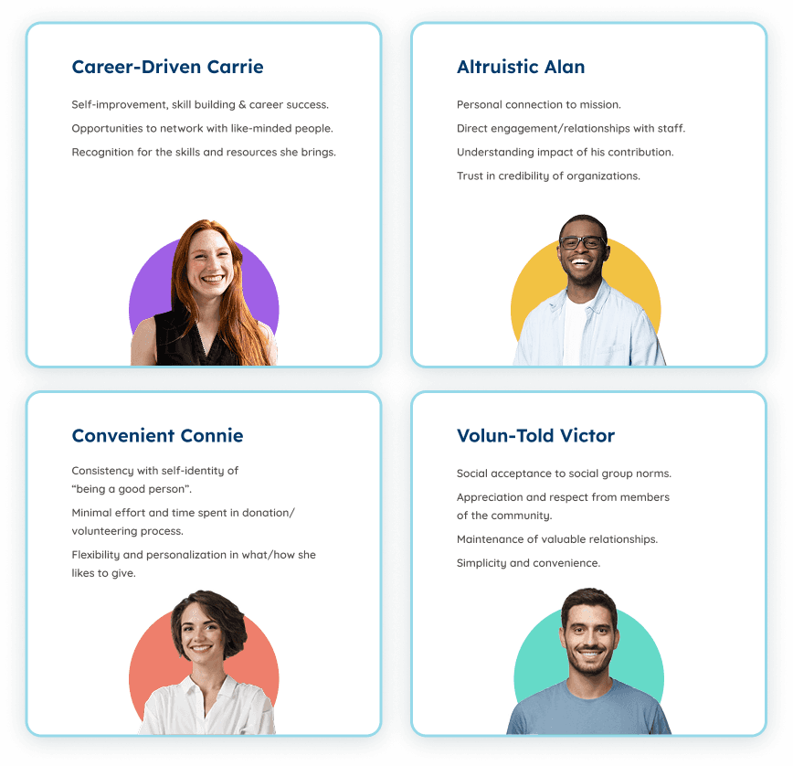
Who are we designing for?

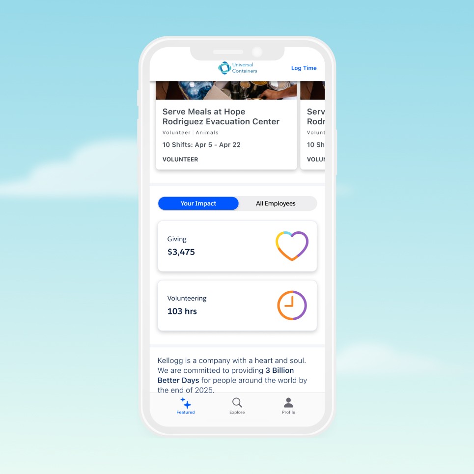
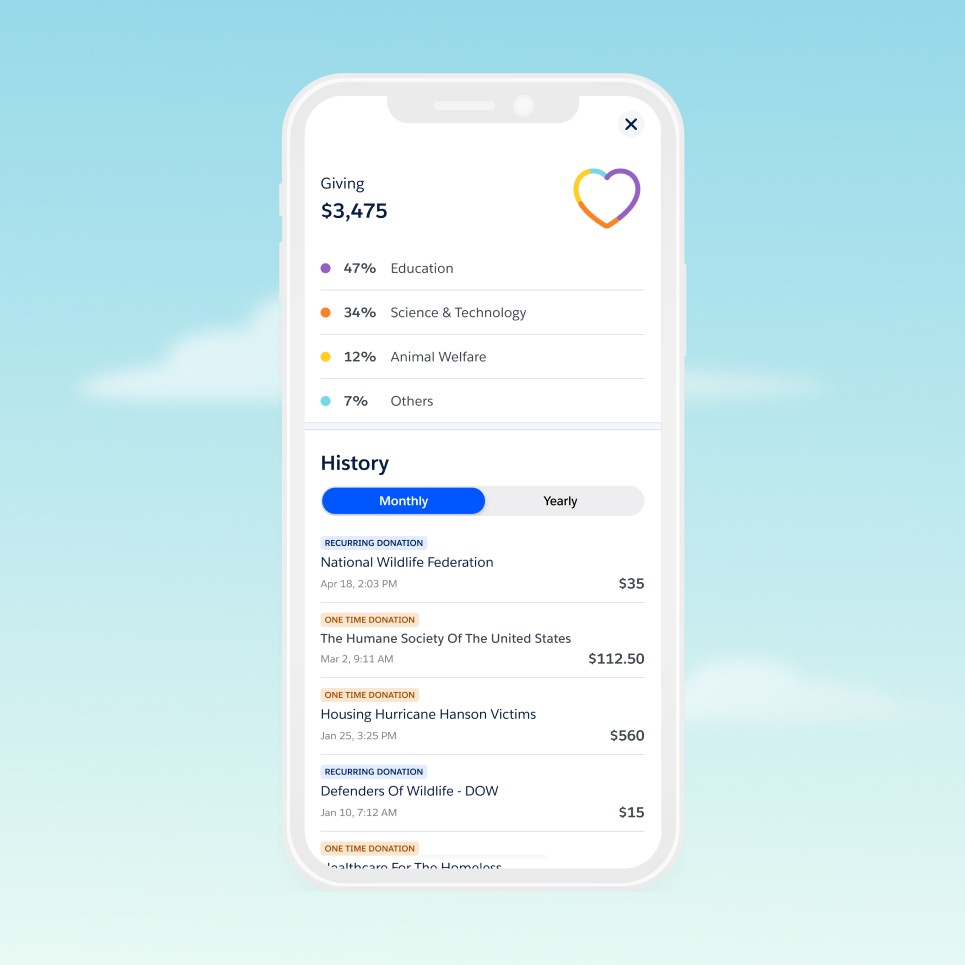
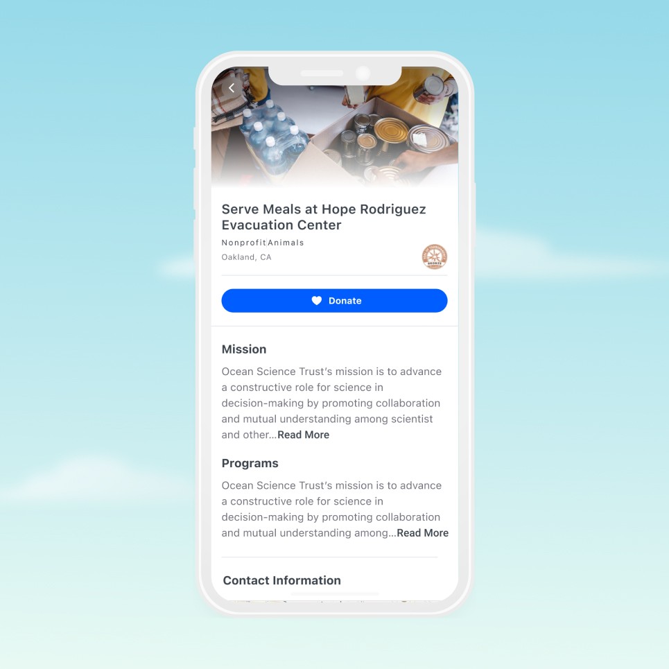
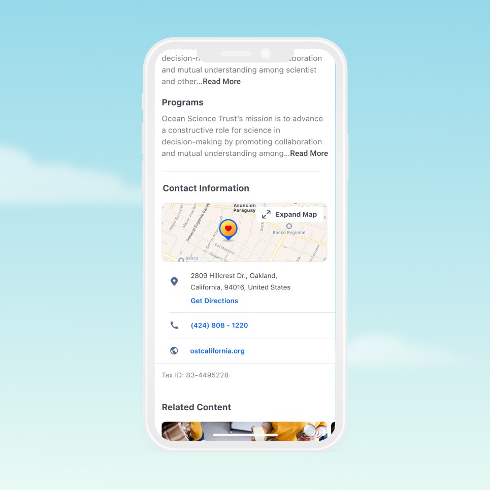
Philanthropy Cloud serves three distinct user groups—employees looking to give and volunteer, companies managing corporate social responsibility programs, and nonprofits expanding their donor networks. To design effectively, we needed to understand each perspective deeply. Through workshops, knowledge transfer sessions, and customer interviews, we identified four key employee personas that would guide our design decisions:

The approach

Building a cross-platform mobile experience through user-centered design, rapid prototyping, and collaborative iteration with engineering and stakeholders.

Impact Widget | Redesign

Streamlined component hierarchy with distinct color mapping per cause category. Tap interaction triggers expandable detail view using progressive disclosure—balancing glanceability with comprehensive information access.

Donation history & Donation overview

Transparent overview displaying donation allocation by cause with percentage breakdown. Tabbed history view (Monthly/Yearly) with clear donation type indicators (Recurring/One-time) enables efficient tracking and reinforces giving patterns.

Nonprofit Details Page | Redesign

Refined hero section with clear typographic scale, visual balance, and improved content hierarchy. Implemented progressive disclosure via "Read More" interaction to maintain consistent spacing rhythm and prevent overwhelming users with dense content blocks.

Contact Details + Map Integration

Native map integration with interactive location marker and expandable full-screen view. Direct "Get Directions" action enables seamless handoff to native navigation apps. Contact information structured with clear visual hierarchy and actionable elements (tap-to-call, tap-to-visit).

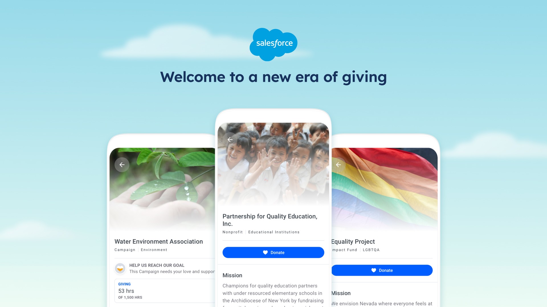
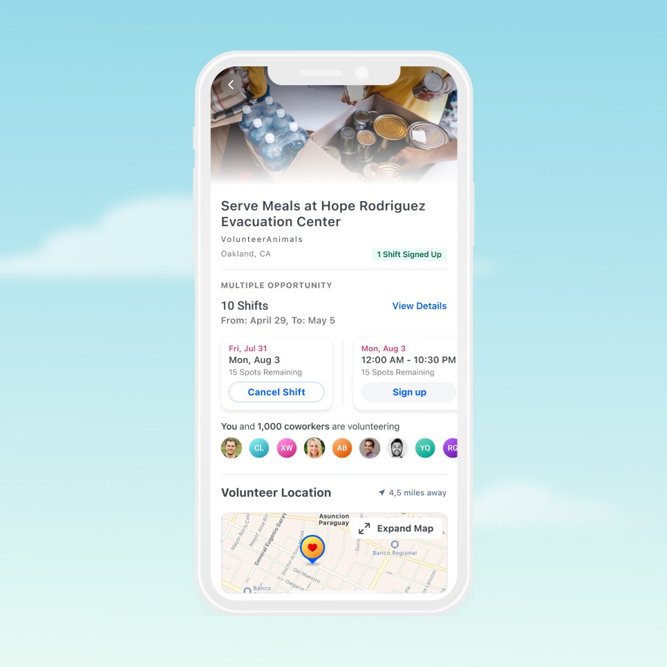
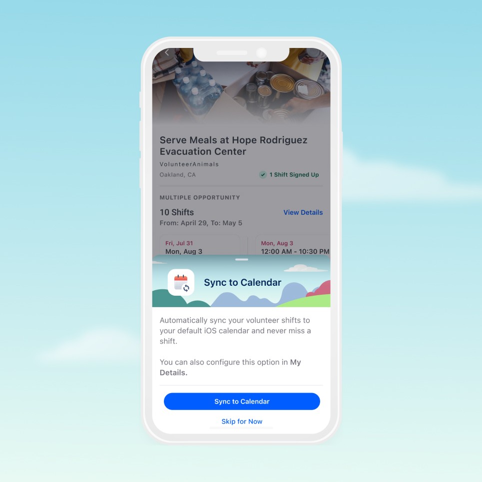
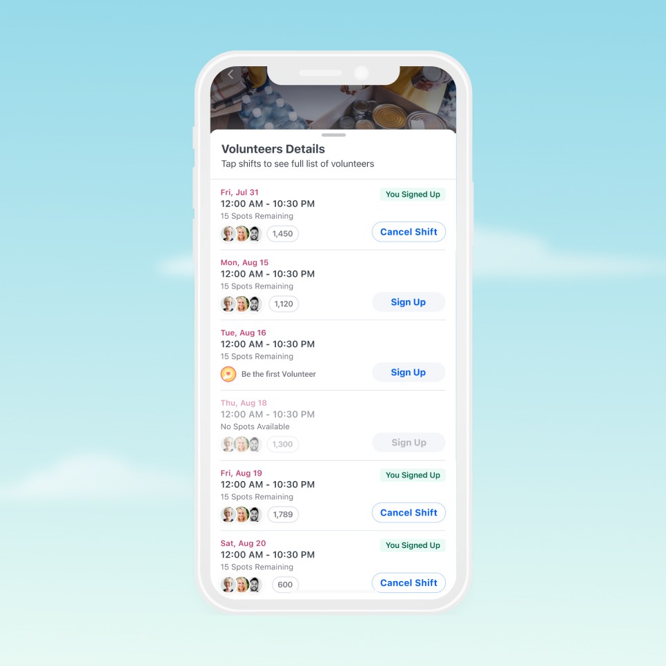
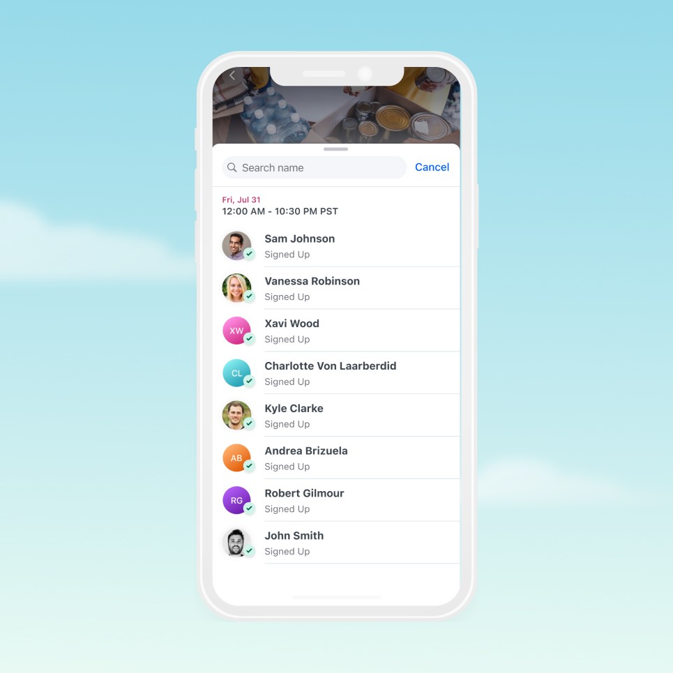
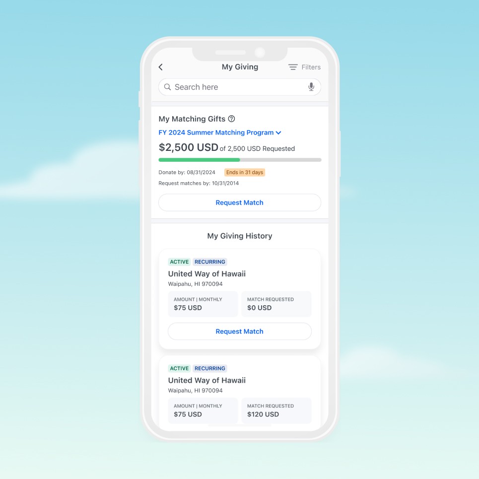
Search + Filters experience.

Volunteer Opportunity Details Page | Redesign

Implemented horizontal scroll pattern for shift selection, optimizing screen real estate for multi-opportunity events. Social visibility feature displays colleague participation avatars with count ("You and 1,000 coworkers are volunteering")—leveraging peer influence to increase sign-up conversion and build trust through visible community engagement.

Sync to Calendar Integration

Native calendar sync integration reduces missed volunteer commitments by automatically adding shifts to device calendars. Modal appears contextually post-signup with clear value proposition and "Skip for Now" option—balancing conversion with user autonomy. Secondary entry point available in profile settings for later configuration.

Social Visibility + Sign Up Action

Tappable avatar clusters display participant preview with aggregate count for each shift. Interaction reveals full volunteer roster—applying social proof to reduce sign-up hesitation and enable informed shift selection based on colleague participation. Clear status indicators ("You Signed Up", "Be the first Volunteer") and contextual CTAs ("Sign Up", "Cancel Shift") streamline action-taking.

Volunteers Overview

Searchable volunteer roster displays all shift participants with visual confirmation ("Signed Up" status). Improved avatar system uses colored initial badges for users without profile photos—enhancing scannability and visual distinction compared to generic placeholder images. Search functionality enables quick colleague discovery in large volunteer groups.

Matching Gifts + Giving History

Corporate matching program integrated into Giving History with dedicated card component. Progress bar visualizes match fulfillment, deadline countdown creates urgency, and prominent "Request Match" action streamlines submission. Giving History cards restructured with clearer information hierarchy—status badges (Active/Recurring), donation amounts, and match request status presented with improved visual balance and scannability.

Donation Details

Improved information architecture with clear visual hierarchy and logical content grouping. Payment Details section consolidates transaction information (Donation ID, payment method, recurring schedule) for comprehensive transparency. Giving History timeline displays chronological payment records with "Paid" status indicators and downloadable receipt links—enabling easy record-keeping and tax documentation.

The impact

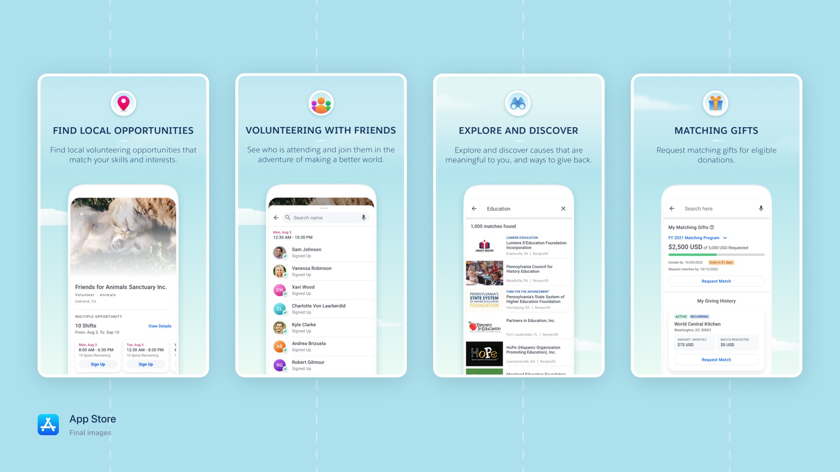
Launched on schedule in under one year, the Android app brought mobile-first corporate giving to millions of enterprise employees across Fortune 500 companies. The improved iOS experience addressed key user pain points, creating a cohesive cross-platform product. Post-launch feedback highlighted intuitive search, social visibility features, and seamless volunteer management as standout improvements—transforming how employees engage with causes and strengthening connections between companies, employees, and nonprofits.

<12 months

<12 months

Android app from 0 → 1

Android app from 0 → 1

Android app from 0 → 1

2m+

2m+

Enterprise users

Enterprise users

Enterprise users

1K+

1K+

Global companies

Global companies

Global companies

Designing for impact

Corporate giving shouldn't feel like an obligation—it should feel natural, meaningful, and connected to something bigger.

We redesigned Philanthropy Cloud around this principle: remove friction, add meaning.

Giving became less about transactions and more about connection. We maintained Salesforce's Lightning Design System while ensuring the experience felt truly native to each platform. Every interaction was designed to feel effortless.

The result: corporate philanthropy transformed from checkbox task into genuine opportunity for impact—making it as natural to give as it is to collaborate.